Samhain Teaser

Leyden jar teaser The image is taken from a silver print of a Leyden jar discharge by Kuele. I really enjoyed ghosting the text in this teaser and didn’t quite get the effect I wanted in the final flyer: This was another one where I felt like I didn’t really have enough to work with conceptually, but the image in the center is constructed of a murmuration, the mirrored leyden jar discharge, and mirrored moth chrysalises. ...
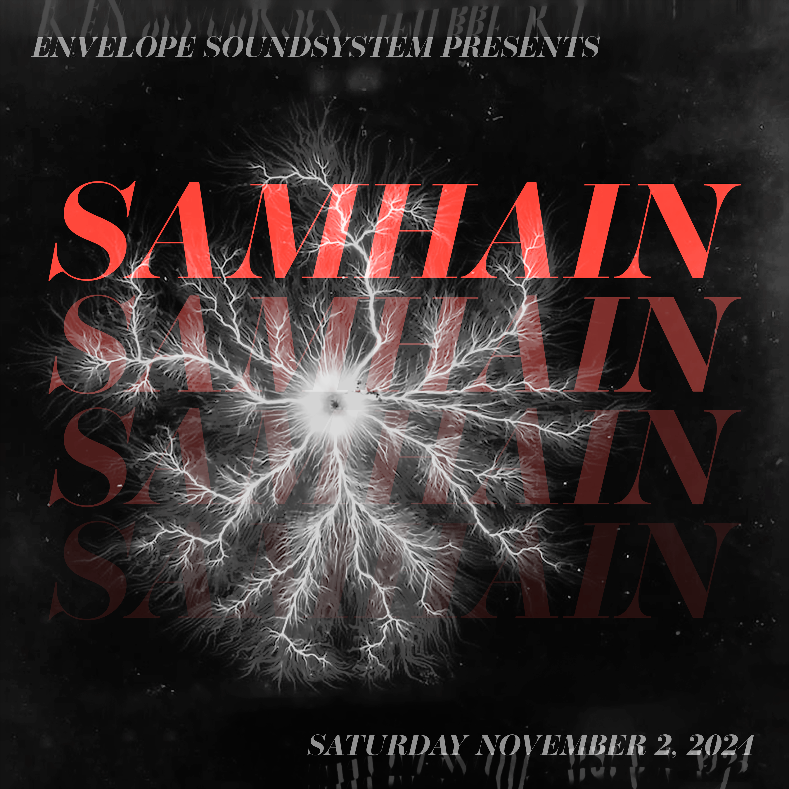
teaser of leyden jar discharge

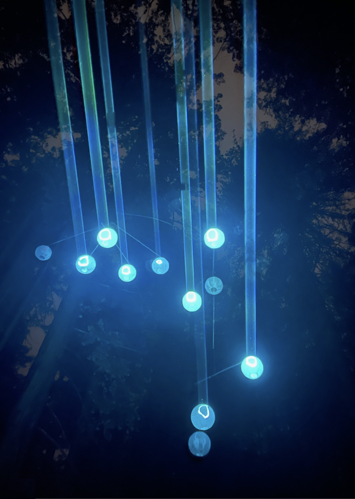
laser orbs lighting for eostre 2024

Background and Outcome This lighting installation was a fever dream; two weeks of near-daily workshopping by L., J., N., and myself resulted in an installation that was perhaps the most synergistic we’ve ever created together. Concept: a laser projects onto objects that diffuse light down onto the dance floor. We ended up using IR LEDs inside paper lanterns as the objects, arranged in a traditional calder mobile construction to form a sculpture. On the ground we used a camera with an IR filter, MadMapper, and Resolume to provide visual output to a laser which projected onto the sculpture. ...

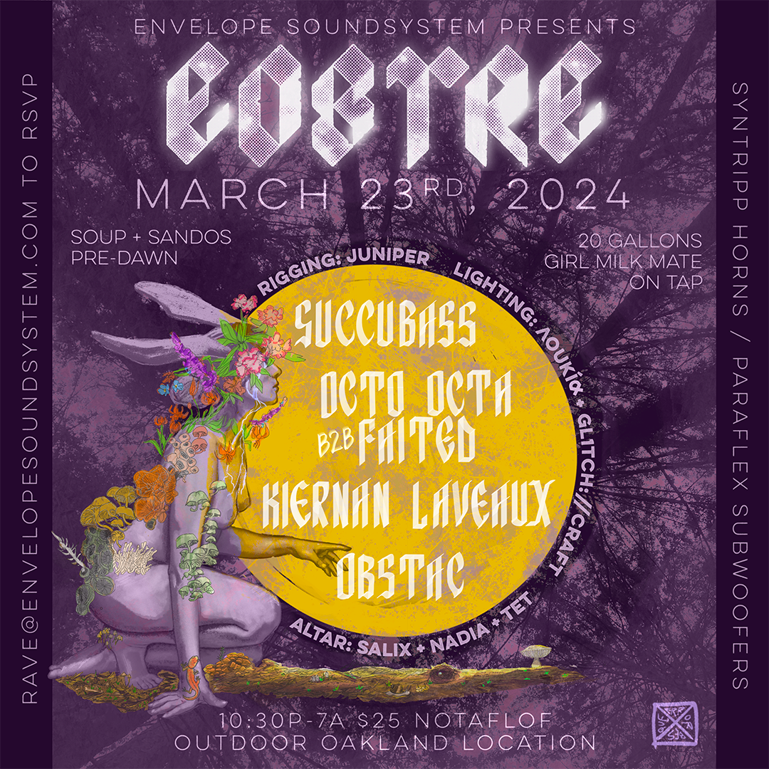
Eostre 2024

really struggled with this one. we were all feeling like it was hard to do anything celebratory during the genocide. i presented a few options that were rejected due to their perceived morbidity since that sort of imagery was hard to look at by members of the collective. i wasn’t really happy with this sketch nor did i feel like it really captured the event, but threw it together last minute (decay/growth on the bunnygirl). ...

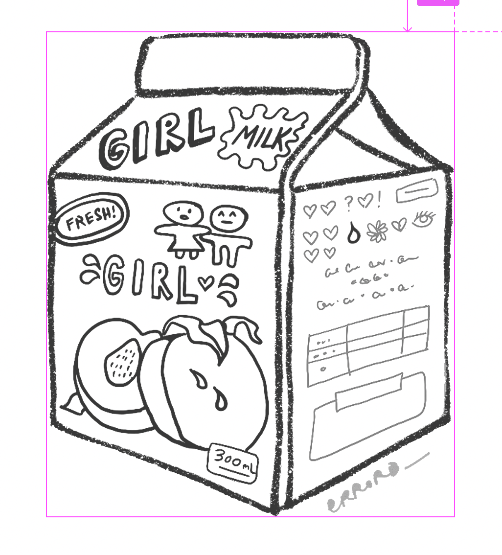
girl milk sketch

just a sketch i did on my lunch break that people seem to like a lot . _ . made a sign (that L. printed) and stickers (that I ordered) for girl milk mate, a drink we sold at a small event. anime version that went over the booth

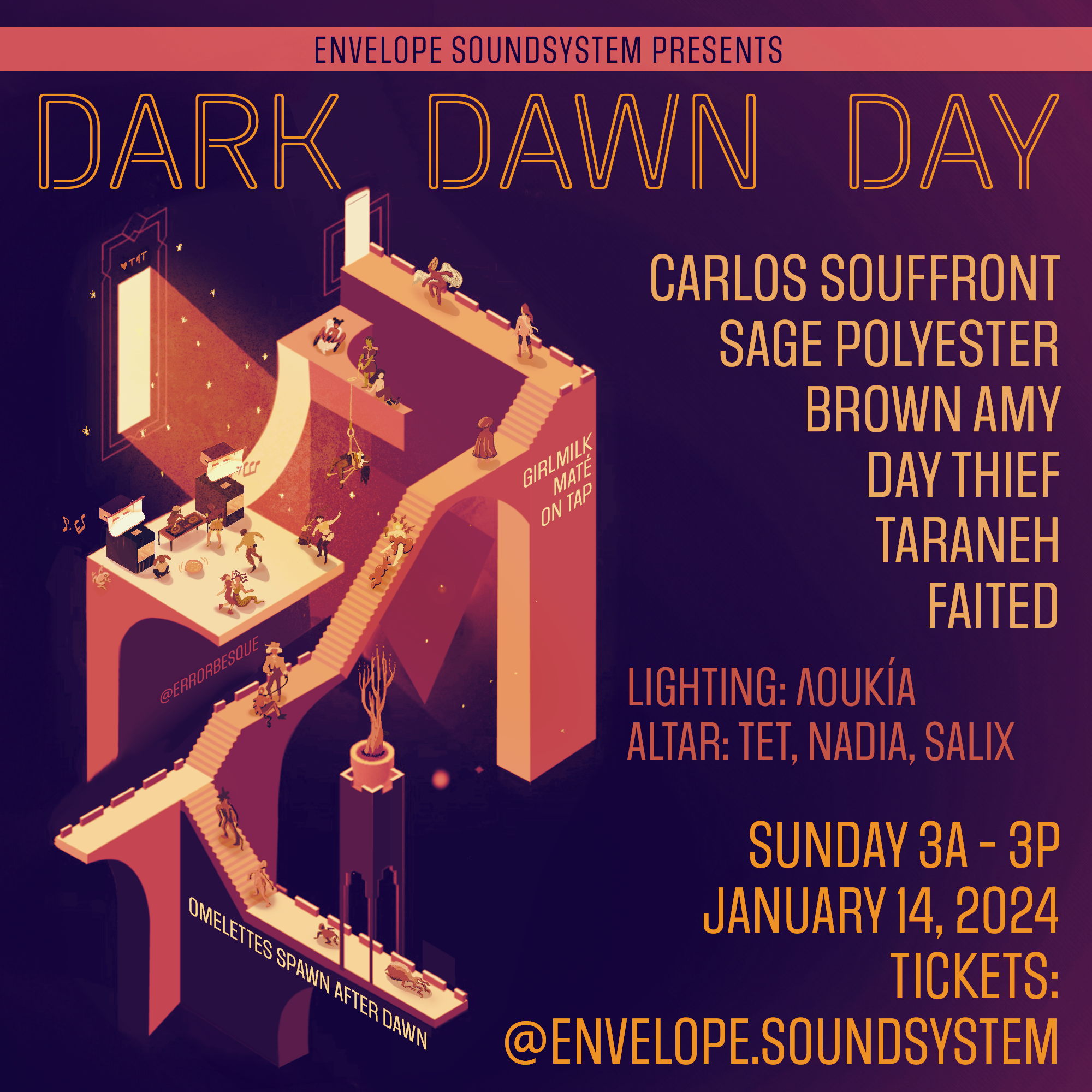
Dark Dawn Day Flyer

prompt: queer hedonism in the darkness, light pouring in, different levels (hosted in a 3-story warehouse with a plan to dramatically tune the amount of light coming through the blocked-off skylights to the music) used a monument valley layer as the scaffolding, redrew everything in illustrator, had fun (though spent quite a lot of time) illustrating tiny figures all interacting in the scene. gradient map cost some detail but overall okay with it. ...

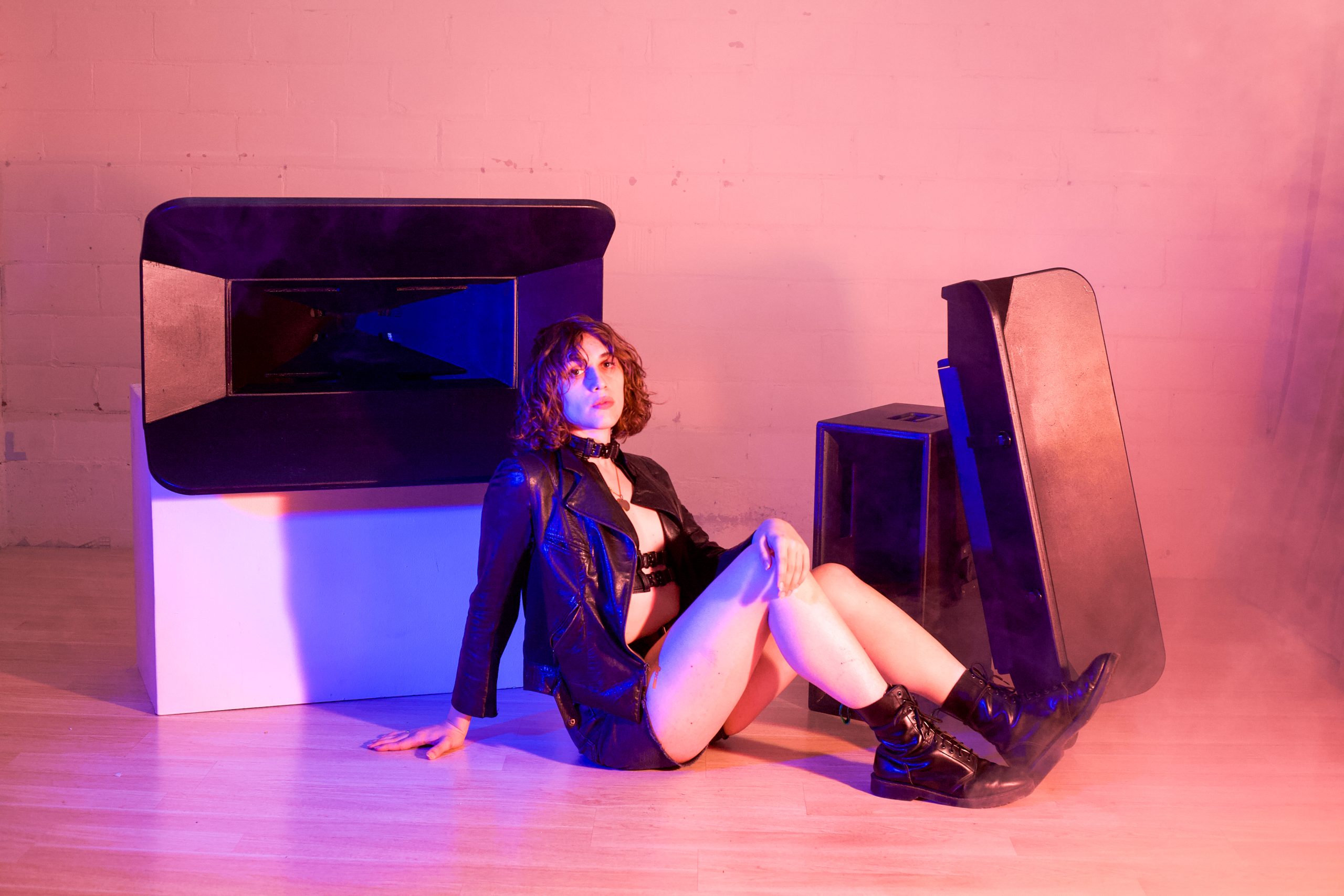
syntripp horns shoot

I employed fog and small blue/red gel contrast for a bit of a glamour shoot with F. and horns that she built from scratch. I thought the gels were a needed element because of how black and featureless the horns are without angled illumination; this way you can see their form and depth more distinctly and it also lends the shots a bit more of a stylized polychromatic look. This came together very quickly since I work with F. a lot and I feel like they’re some of the most efficient but pro shots I’ve ever done <3 ...

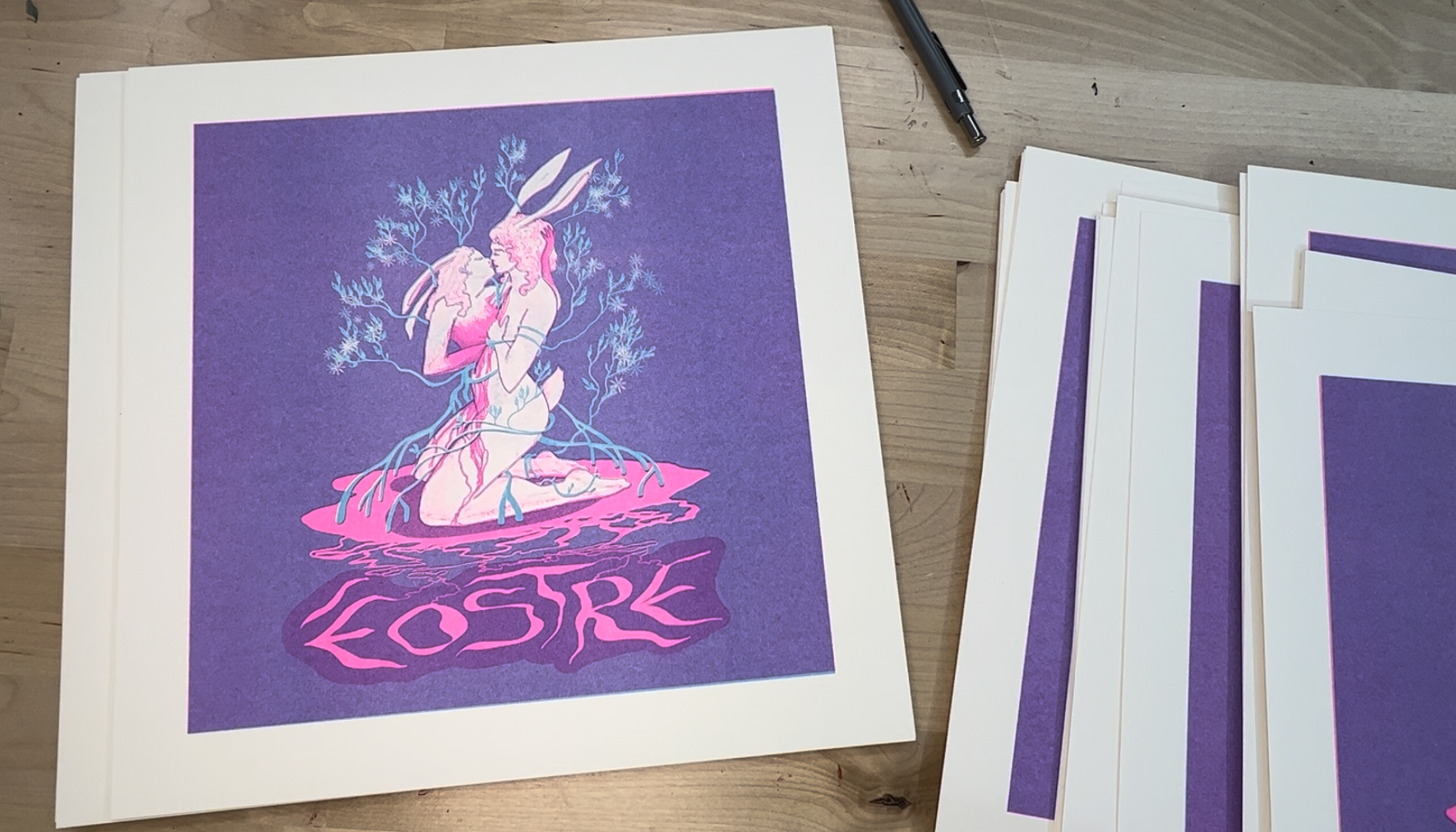
first risograph print run

it felt really good to get prints out (their weight and the texture of the riso is so satisfying in person!) and to have people want to buy them at the soundsystem check by the lake on a sunny day. i easily made back the cost of printing (2-color risos from tinysplendor.com) and made a decent profit. i still have more to move and guess i need to get good at marketing? ...

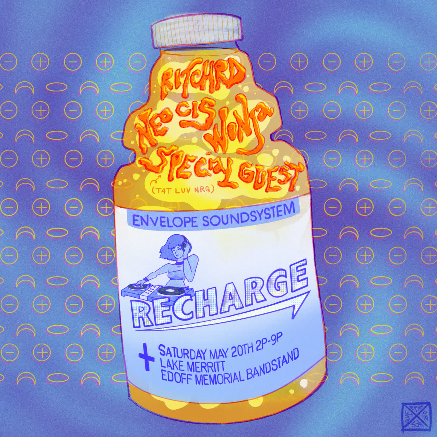
Recharge

i wanted to go with a lighter theme than i usually do for my first daytime event flyer. we picked the name to reference an electrolyte drink product remembered fondly from one of the collective member’s childhoods. the background is full of electrolytes in lithium ion batteries (since this event tested the function of a custom battery build, which was successful! the entire soundsystem ran for several hours off of a custom setup of hacked tesla batteries, engineered brilliantly by L. (we did have generators ready as a backup, but didn’t need them)). ...

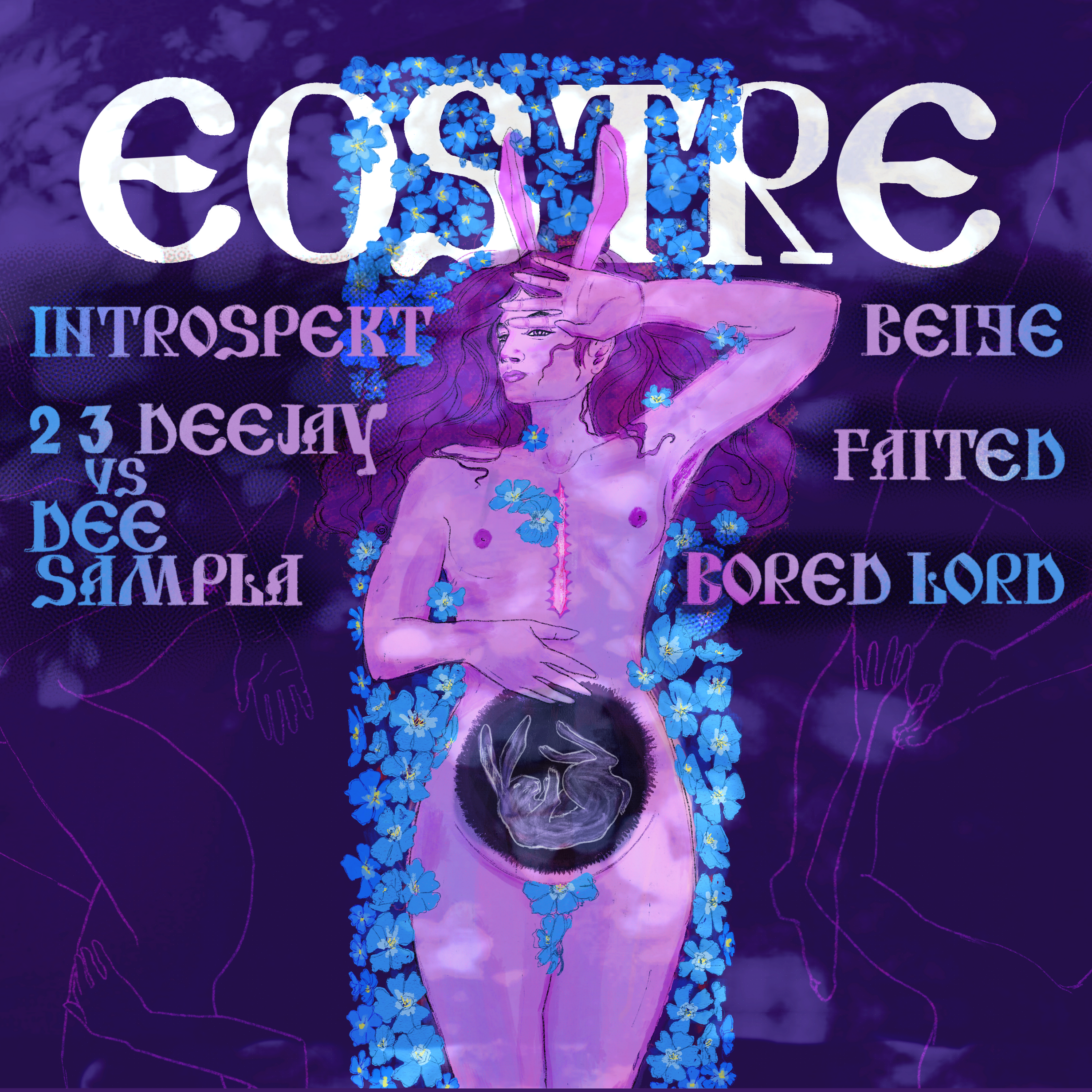
eostre 2

continuation of the story from last year – the bunnygirl’s scar is healed up, she’s surrounded by blue flax flowers (native californian plant recommendation by members of the collective), the lines of past lovers are outlined on the floor, the tree shadows dapple the ground, there’s the insinuation of pregnancy. hand-drew the type inspired by several orthodox russian typefaces (but made it more legible). initially had a cross out of the blue flax which i quite liked but it gave the bunnygirl a decidedly too christ-like cast. ...

eostre set design

most of the hard work here was done by L. who implemented the extremely well-engineered lights and our rigger J. who set up the tree rigging, but i refined some alternatives with a 3d scan of the site and advised on what dimensions i thought would feel good for the dancers. (note to self: the physical-bottleneck “trap” of the front of the dj booth is not to be repeated!) ...